In November I’m celebrating Polienne’s 9th birthday. That’s right, I’ve been blogging on this platform for almost 9 YEARS! And as you can see, with this big birthday coming up, I’ve already decorated the place a bit…
…with a spanking new layout! The previous one had been with us for about 2,5 years now and although I still really love its quirkiness and uniqueness, a change is always fun. We grow, so why not let our websites grow as well?
I feel like this design is a fresh and grown-up version of what I tried to achieve with the previous one: showing my readers my style and content in a blink of an eye. No scrolling through several blogposts until you see something that you like, but a fun, slightly messy overview of LOADS of content and instant inspiration so that you immediately can pick what catches your eye. And then secondly, experiencing my content in a clean, feminine environment with lots of white space and beautiful fonts.
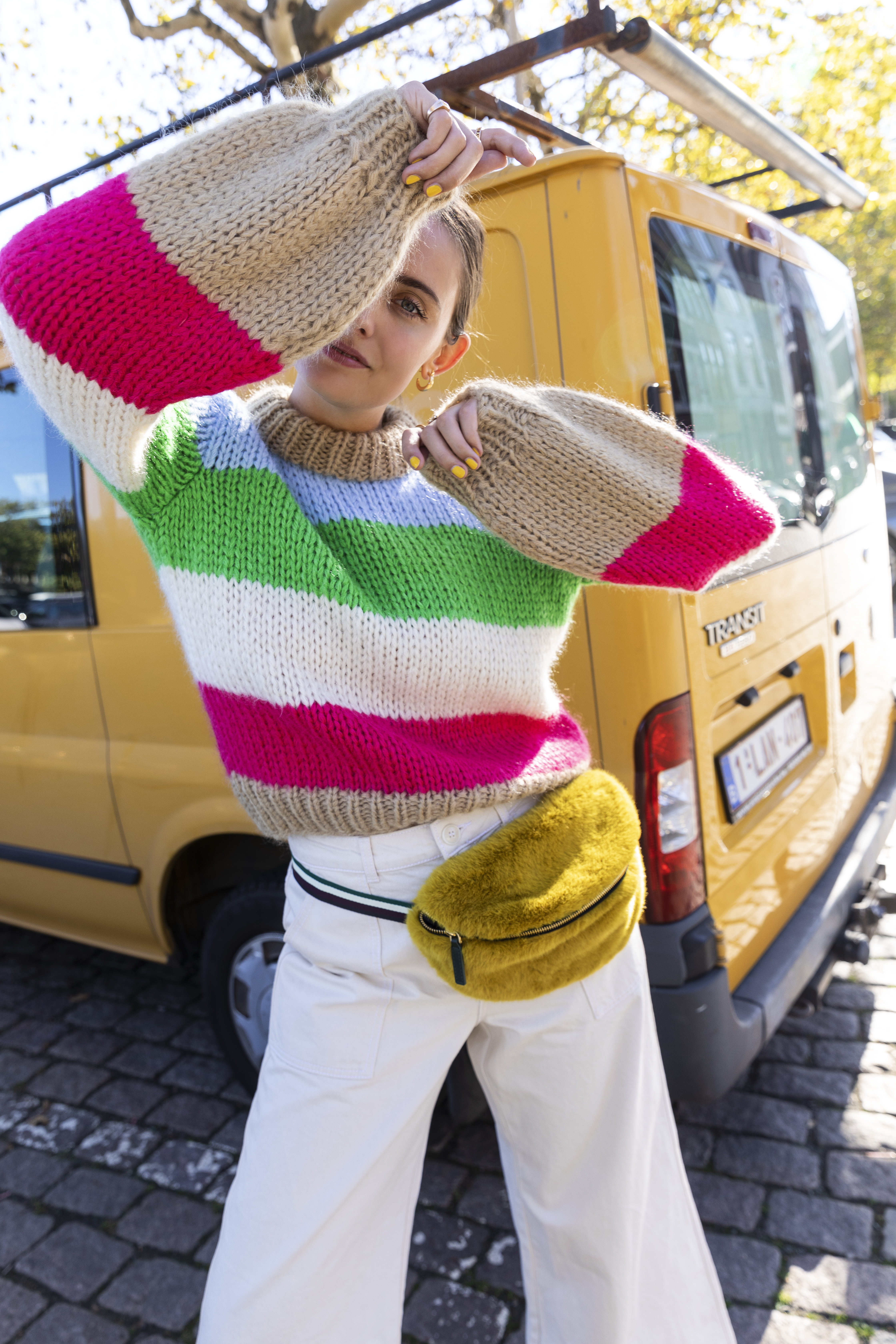
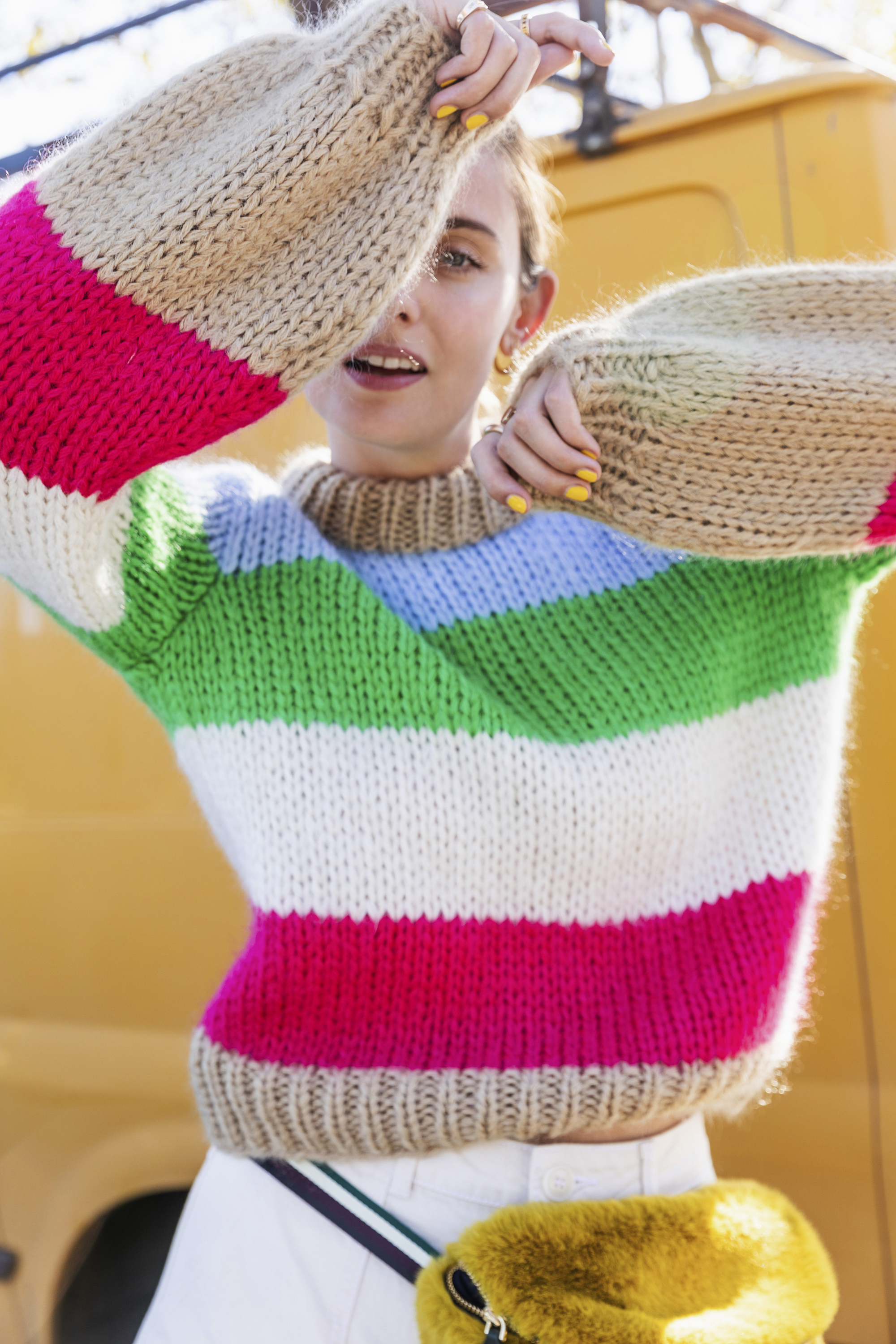
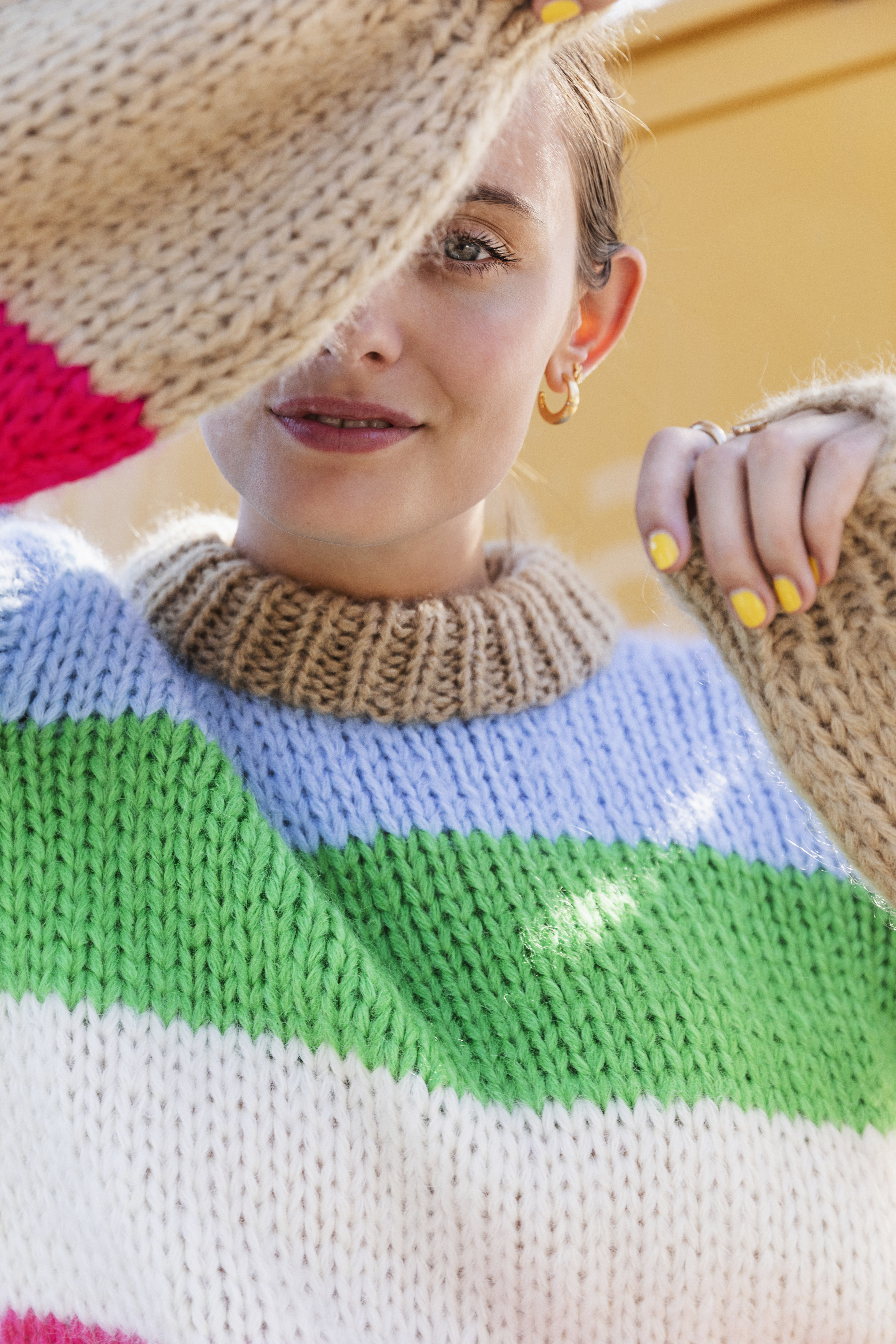
These bright colours look pretty good in their new surroundings, don’t you think?


PS: to see more of the outfit, go here! / photography by Felicia Van Ham
